Yayoi Kusama at the Rubell Museum

A couple of weeks ago, I traveled to Miami for the first time and was excited to see what the hype’s all about because Miami’s really made a name for itself as the ‘it’ scene for high-profile art in the US. The number of gallery/museum options was overwhelming and I had practically only 1.5 days to myself so I had to judge a book by its cover to decide which one I’d visit. They all looked equally impressive and I would’ve given anything for a little more time to see even just the buildings. Ultimately, between the Institute of Contemporary Art and the Rubell Museum, the Nara Yoshitomo and Yayoi Kusama exhibits at the Rubell were the winning factors (I love Nara, my first tattoo is of his work.)

The Rubell Museum, formerly known as the the Rubell Family Collection, houses, amongst other works, the private collection of Don and Mera Rubell (as the name suggests), who’ve acquired more than 7,200 works by 1,000 artists and also played a role in attracting Art Basel to Miami. The collection had recently moved to a complex of six former industrial buildings that now include 40 galleries, a flexible performance space, an art research library, a bookstore, and a restaurant that opens onto a courtyard. For those who love MoMA PS1, I would highly recommend it.

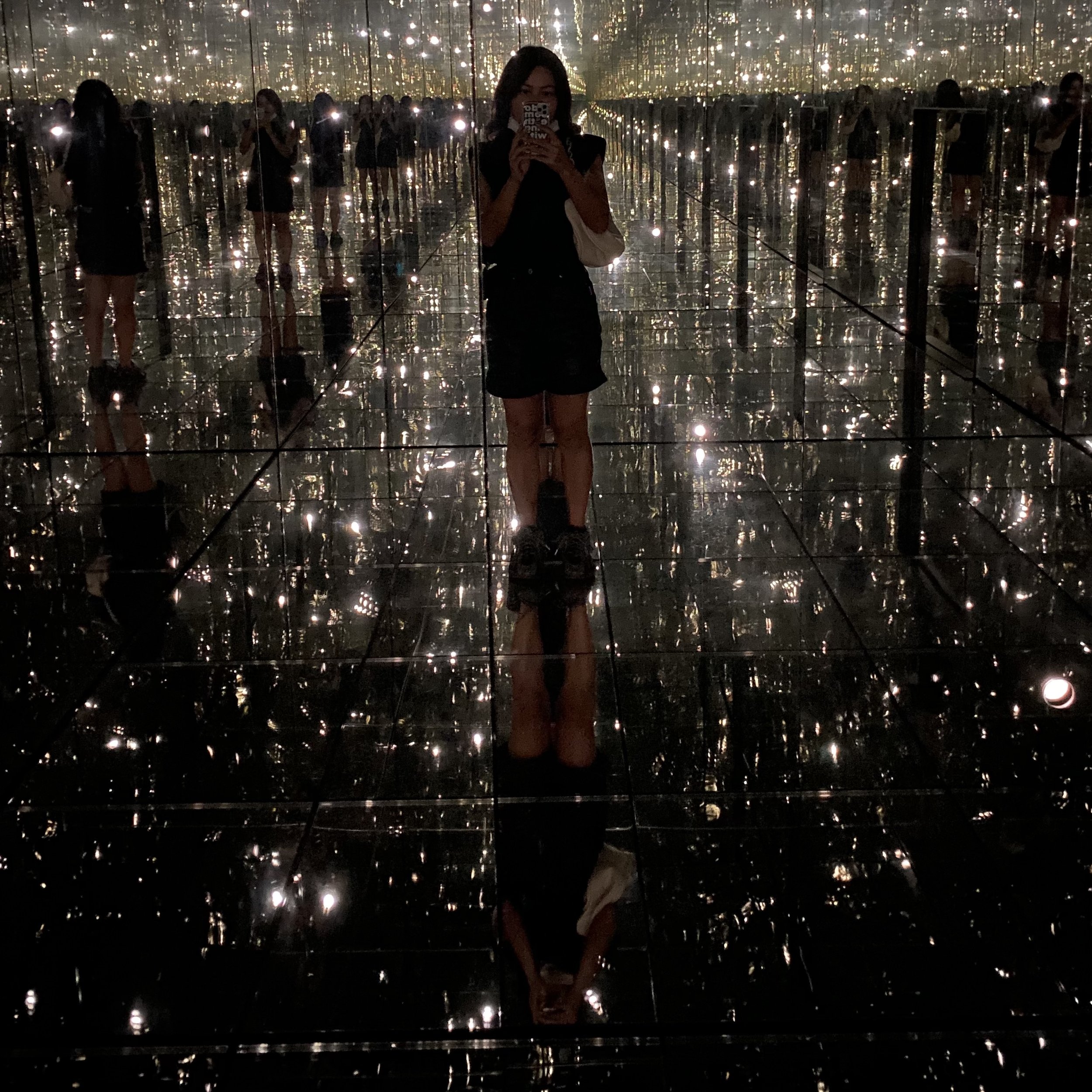
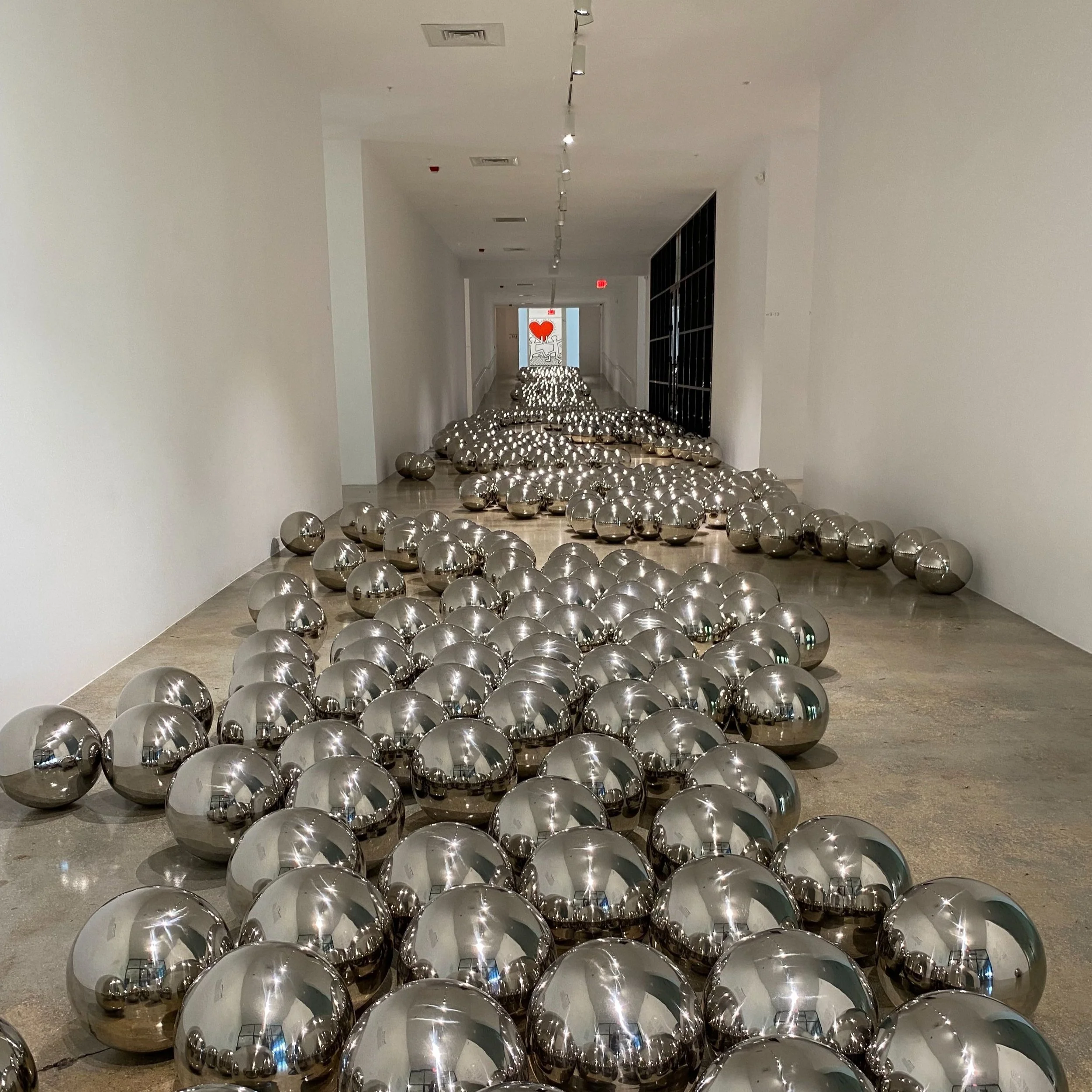
When I visited, I think there were only 36 galleries open to the public, 3 of which were Kusama’s Narcissus Garden (1966), Where the Lights in My Heart Go (2016), and INFINITY MIRRORED ROOM - LET'S SURVIVE FOREVER (2017). Access to the Infinity Rooms are timed and limited to 1 party at a time so I recommend going on a weekday during off hours.

Narcissus Garden is the first thing you see when you enter the museum, and flows 200 feet along the central hall, so it’s hard to miss. Kusama debuted the stainless steel spheres in 1966 at the Venice Biennale, where she stood with a sign reading “Your Narcissism for Sale.” 55 years since then, and her sign could not be more apt, especially now that almost everyone owns a smartphone. I’m definitely guilty of spending the first 20 mins trying to get the perfect shot of myself.

Next was INFINITY MIRRORED ROOM - LET'S SURVIVE FOREVER, which features the same spheres, suspended from the ceiling and arranged on the floor, and mirrored walls that make the space look like it’s filled with an infinite number of silver balls and reflections of yourself. There was someone already inside of the room when I arrived and as I waited, I noticed that the museum employee standing outside the room held a stopwatch and knocked on the door. I assumed that maybe that person had spent too much time in there but apparently you’re only allowed 1 minute inside, which is a guideline Kusama set herself.

Lastly was Where the Lights in My Heart Go. If LET'S SURVIVE FOREVER looks like the inside of a space station to you, then Where the Lights in My Heart Go would look like the galaxy that your station floats through. It’s a 10x10 foot polished stainless-steel room likewise with mirrored walls but this time with small holes to allow ambient light into the dark room. What you see and experience is unique to where you stand. And I don’t only mean where you stand inside the room but geographically as well. The light that leaked in was red because of the Keith Haring piece hanging in the next room but if this were in another museum, it would look totally different.

I got to go in twice. The first time, I had a hard time getting out because it’s dark and the door is heavy and low to the ground*, and I panicked, unsure of whether anyone would notice I was stuck inside. When I finally exited, the same employee with the stopwatch from earlier was standing outside and he suggested I go in again, this time without any of my belongings. He told me to try to lose myself and stay in there as long as I can. So I went back in. Turns out he had been timing me, to see how long I would stay put. According to him, most people don’t last very long because of distractions and short attention spans. He congratulated me for my almost 2 min record. If you ever get a chance to step inside one of Kusama’s Infinity Rooms, try timing yourself!

*Fun fact: the door is placed low so that visitors bow their heads and humble themselves in preparation for what they are about to experience

Lombard St or a Worm?: Deciphering the Muni Logo

Screen Shot 2021-10-09 at 9.46.09 AM.png

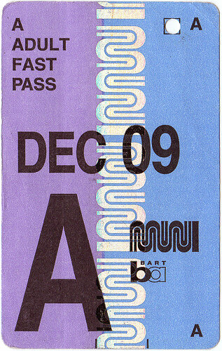
As both evidence and apology for my inability to sit down and write lately, I’m back with a really short post on the history of the current SF Muni logo. Despite living here 20+ years, it was only 5 years ago that I realized that it actually spelt out “M U N I.” It wasn’t like I looked it up or spent some time trying to figure it out, I was just sitting on the train, zoned-out and bored, with nothing to do because there’s no service underground; I was absent-mindedly looking at it, when BAM, it finally hit me. I got a lot of Haha reactions out of it on Facebook but in my defense, I’ve been exposed to it before I could even read, so to me as a kid, I thought the logo was a pictograph of squiggles and I just continued to assume the same as I grew older (and I confirmed with friends I grew up with, that they believed the same.)

When I made my post on Facebook, I got a comment from a Taiwanese friend that she instantly saw it as an homage to SF’s famous Lombard Street. It was a theory, one that’s been echoed by commenters on other forums, but hasn’t been addressed by the Municipal Transit Agency. In fact, the MTA seems to refer to this particular logo, of all their logos in their ~100 year history, as….the worm.

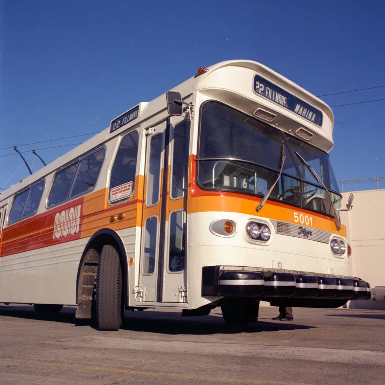
As part of Muni’s larger rebranding effort, the worm was debuted in 1975 by famed SF-based designer Walter Landor, who might otherwise be known as the legend behind Coca-Cola and FedEx’s logos. It apparently cost a whopping $100k to develop, which I guess is nothing compared to the other ridiculous things the city’s spent money on (like actual trash.) Even though the rebranding effort of the 1970s was allegedly a big deal, I found very little from the MTA about the inside-look or unveiling of these projects. I also read a comment about the squiggles representing the railway tracks, which makes the most sense, but that can neither be debunked nor confirmed.

In 1997, there was an attempt to find a new logo, the logic being that a a cosmetic makeover would “boost employee morale and give the public a new sense of confidence in the ailing agency, which has been denounced by critics for rude drivers and constantly late buses” (make it make sense?? maybe invest in those problems first??) However little we know about the worm logo, it’s withstood the test of time and has become a local and national favorite.

Bonus content: Love this “vision for the future” rebranding concept by designer Derek Kim. Unfortunately, I don’t think he was anticipating the rise in popularity of Supreme so I would reconsider the colorway but otherwise, I’d love to see his sign posts and totem poles come to fruition one day.

New Muni Logo January 27, 1975.

New Muni Logo January 27, 1975.

A 1996 ad for a streetwear brand?

A 1996 ad for a streetwear brand?

We all want to bring these back.

We all want to bring these back.

A girl can dream.

A girl can dream.

A flyer I made using the free MUNIficent font.

A flyer I made using the free MUNIficent font.

49 Hopkins: Here Lies The Remains of Richard Neutra's Work

My dad often asks me, “did you enjoy your childhood?” When my family first moved to San Francisco in 2000, my parents knew very little about the city and let a realtor, who couldn’t care less about our best interests, decide the neighborhood we’d settle in, which ultimately determined which schools I went to, the friends I made, the businesses we frequented. Having once again gone through the process since then of looking for and moving to a new house, my dad often expresses his frustration with that first realtor because apparently, she had hardly shown them the city’s single-family residential areas, which were much cheaper at the time and would’ve made a greater return on investment than the Twin Peaks condo we ended up buying.

But I wouldn’t trade the 14 years I spent in that neighborhood for the world. I developed my affinity for deriving and urban hiking then because we were located at the intersection of, what I would argue are, San Francisco’s most interesting neighborhoods. There was Forest Knolls and Forest Hills to the West, Haight Ashbury and Cole Valley to the North, the Castro and Noe Valley to the East, and Diamond Heights and Glen Park to the South. All within walking distance. Amazing views, hidden staircases, a range of architectural aesthetics, our 1983 condo had a birdcage elevator and a bar! The higher up on the hill, the more impressive and imposing the houses; I spent many walks with my dog and iPod Video admiring a particular home just a couple blocks away from my own.

147454587_3114404472123855_4321450726126411477_n.jpeg

There’s something very special about the architecture in this area (as a kid/teen, I couldn’t put my finger on it but later discovered @moderndiamondheights, which captures its characteristics perfectly.) Maybe because of the way we were situated on the hill, with bright blue sky ahead of us and rolling fog behind us, many residences had skylights and greenrooms to make the most of the temperamental access to sunlight. But the building on the corner of Hopkins and Burnett was different. While the other homes had a sea ranch-esque preference for wood and earthy-elements, this one was all white, somewhat sterile looking from the outside, and didn’t look lived in. But nonetheless, something about it just makes you want to stop and stare.

The circumstance under which I finally discovered its significance was…unfortunate. 49 Hopkins Ave is actually Richard Neutra’s Largent House and in 2018, it was illegally razed by a selfish developer who purchased the property for $1.7M the year prior. Despite being the first of 5 houses Neutra designed in the Bay Area, there isn’t a lot of information about it and if you do attempt to Google search, I suggest you filter for results pre-demolition.

Commissioned in 1935 by Lydia Fuller Largent, an artist and public school teacher, “his approach to design was extremely client-focused, producing his unique and masterful homes that reflect both his own vision married to the direct needs and desires of his client and to the natural environment of the site.” The Largent House was built for a different era of functionality and modesty of its first owners. It was designed to fit the narrow Twin Peaks hillside and “combined older memories of clapboarded, vertically attenuated Victorian San Francisco with typically Neutra fenestration and detailing.” The house was sold to H. R. Stegman in 1962, musician Steve Gungl in 1972, Robert Sorenson in 1982, Derrik Anderson and Wayne Edfors II in 2004, Goldberg LLC in 2013, and fatally to Ross Johnston in 2017.

The city's planning board approved a permit to remodel the house with the caveat of preserving the majority of the first floor. When concerned neighbors alerted the city that nothing was left of the historic home, the case made its way to court, where it was demanded that the house be rebuilt to its original footprint and massing, and to use the same materials that were used in the initial building. But retroactive justification for illegally tearing down everything but the garage and exterior frame, alleged that the house had little historic value left and was structurally unsound. The defending attorney suggested that the house had first been erased in a 1969 fire and remodels in the 1970s and 1980s, which included the addition of an indoor swimming pool.

The public’s reaction to the city’s verdict was mixed. Some advocated for harsher punishment and others close to the architect suggested that if he were alive today, he would disapprove of the ‘Disneyesque’ imitation (part of the agreement included installing a sidewalk plaque.) “To rebuild this house, designed specifically for the Largents over 80 years ago, to represent a current political issue hardly seems like something Neutra would endorse.” The case was appealed in 2019 and the city lost its case, but regardless of the outcome, the loss at 49 Hopkins is irreversible. All that we can do to preserve its history is continue to share stories and pictures of the magnificent, stark white house.

neutra-largent-3.jpg
The only glimpses that we have of the inside are brought to your by real estate listings.

The only glimpses that we have of the inside are brought to your by real estate listings.

“Vault Lights in the Big City” -CeeLo Green

A trip down memory lane for us millenials.

A trip down memory lane for us millenials.

I’m terrified of the ocean. It doesn’t help that I don’t know how to swim but drowning only holds silver medal in my Fear Olympics. If anything, being able to swim further and further out into the water would only exacerbate my anxiety about the unknown that lurks below. More than 80% of the ocean remains undiscovered. I had the same scary thought when I visited Paris 2 years ago. The catacombs? Tiny medieval doors in the facades of the streets that lead to who knows where?? For you Bay Area locals, let me add one more to the nail-biting list of “what tf am I standing on top of?”

An illustration in 1914 "Metal Building Materials" catalog

An illustration in 1914 "Metal Building Materials" catalog

As you’ve walked through downtown San Francisco, have you ever stopped and noticed the grid of purple squares under your feet? As a kid who would read books while walking (I know, dangerous, but don’t worry, these days I only ever look at my phone while walking), I definitely noticed them but never considered to look them up. I just accepted it, much like I accepted the speckled aesthetic of chewed up gum that littered the concrete (both of which we don’t see as much anymore and I sort of kind of miss.) Well, thanks to KQED, we finally know the answer to the question we didn’t even know we had.

If you have a thing for people walking all over you, definitely check out the basement.

If you have a thing for people walking all over you, definitely check out the basement.

Vault lights, pavement lights, floor lights, sidewalk prisms. Tomayto, tomahto. You can actually find them all over the world and depending on where you are, it’ll have a different name and purpose. In San Francisco, the glass prisms were mostly used to light up building basements that extend under the sidewalk. More interestingly, our neighbor to the North, Sacramento, is prone to flooding, so in 1862 parts of the city were raised up to 14 feet and in areas where buildings weren’t lifted, they instead built on top of of the first floor, essentially making it an underground level (Sacramento Underground City is a thing and you can get a walking tour of the abandoned storefront through their History Museum). In other parts of the country, the jewels were used to illuminate the lower platforms of major train stations. Unless dyed to mimic the older ones, if you ever see purple sidewalk lights, it’s your lucky day because the glass only ever turns purple with age, which means you can bet you’re standing somewhere pretty old and historic.

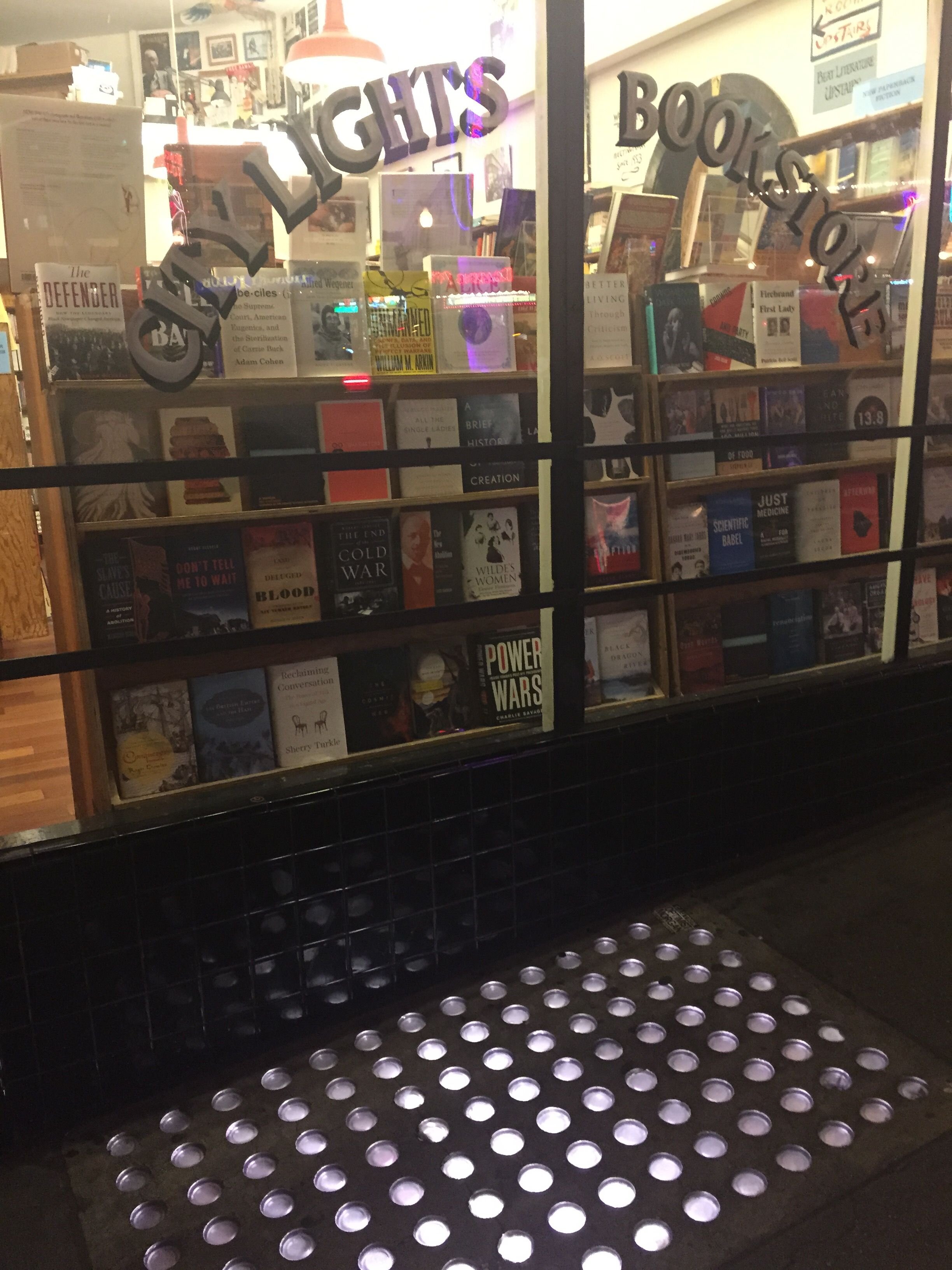
Unfortunately, my hunch was right, and these peculiar attractions have disappeared slowly over the years from our urban landscape. The City of San Francisco considers the lights as having little historic value and a hazard for pedestrians so they’ve removed most of them. I happened on one the other day in the Marina District but purple they were not, and the shattering of the glass makes me think it’s a matter of time before the city replaces it with the hideous red tiles surrounding it. So next time you’re in North Beach, make sure to support one of our last independent bookstores, perfectly named City Lights Books, because it may also be the last place you’ll be able to witness the majestic purple gems light up the city at night.

 
The passenger concourse at the original Pennsylvania Station.

The passenger concourse at the original Pennsylvania Station.

Thanks to these FB comments, I was able to find more San Franciscan examples.

Thanks to these FB comments, I was able to find more San Franciscan examples.

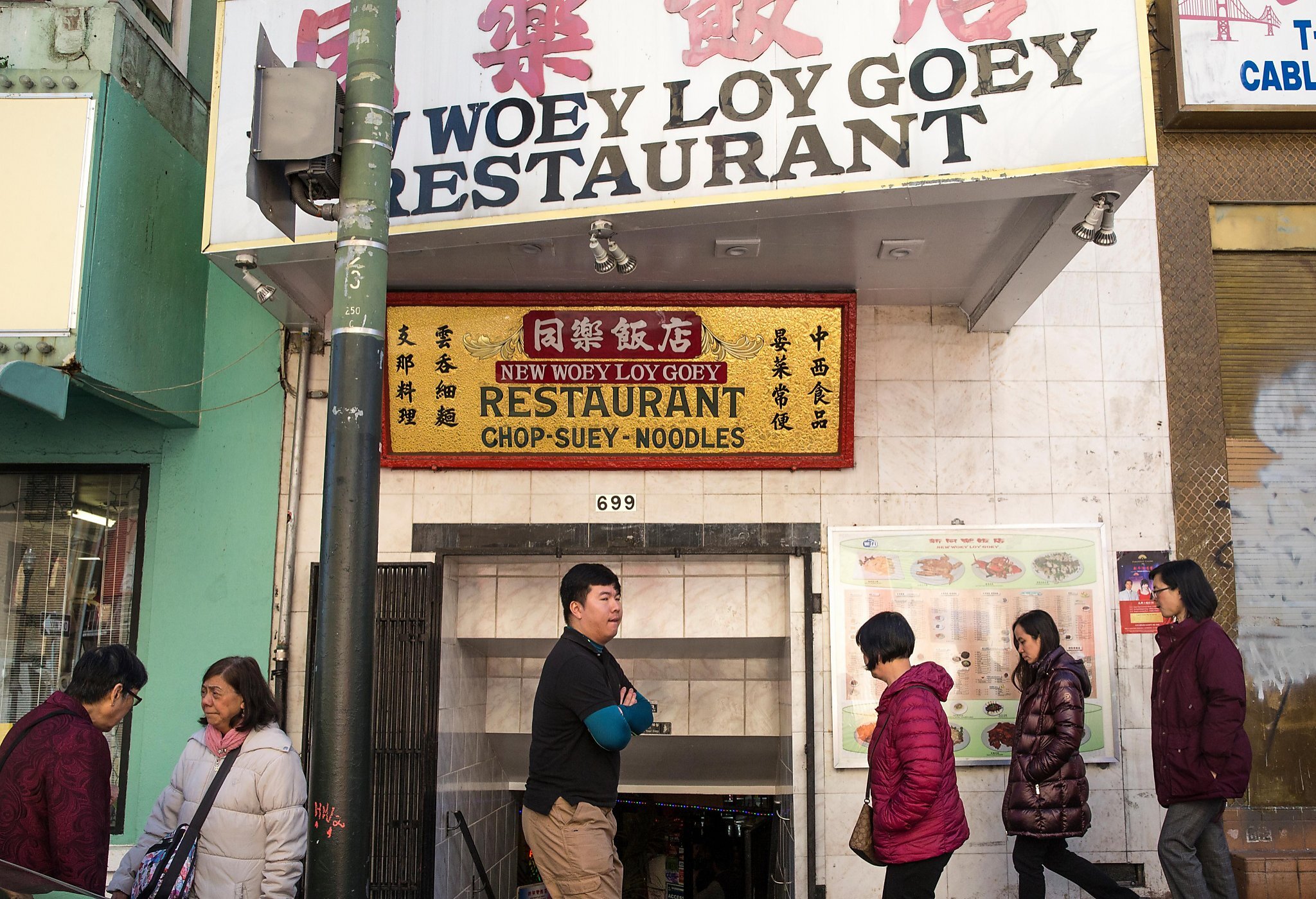
Indeed, the entrance of Woey Loy Goey leads to below the sidewalk. Couldn’t find pics of the bathroom.

Indeed, the entrance of Woey Loy Goey leads to below the sidewalk. Couldn’t find pics of the bathroom.

Also no pics of Spec’s bathroom. But was on my list of places to visit anyway.

Also no pics of Spec’s bathroom. But was on my list of places to visit anyway.

It’s funny to think people used to work in the basement.

It’s funny to think people used to work in the basement.

Alexander Calder's [Xe] 4f145d106s2 Fountain

Electron configuration: [Xe] 4f145d106s2. Atomic number: 80. Atomic mass: 200.59 u. Electrons per shell: 2,8,18,32,18,2. Melting point: -37.89°F (-38.83°C). Symbol: Hg.

Those are all properties of Mercury that I stole from Wikipedia (this will probably be the first and last time I’ll ever need to look it up. Why is chemistry even part of the core curriculum in high school?). It’s 2021. It’s understood that Mercury is highly toxic. If you had a childhood like mine, then you definitely grew up thinking it was up there on the list of things that sucked about being an adult, along with quicksand, piranhas, and MRI scans (or was MRI scans just me?); maybe you remember the thermometers being locked up in cases or using the “I can’t eat that, it’s poison” card whenever Mom told you you were having fish for dinner.

In 1937, that wasn’t the case. But regardless of everything I know about Mercury now, I would pay $3,589.43 to 1) catch a flight to Barcelona at 1:45pm today 2) arrive the next day at 12:35pm their time 3) visit the Fundacio Joan Miró and 4) catch the 6:05pm flight the same day, back to San Francisco, just to see Calder’s Mercury Fountain. Unfortunately, that’s not possible because I’ve got tickets to see a movie in theaters later tonight. That being said, earlier in May, I had the chance to see other works by Calder and Picasso at the de Young Museum. To be completely honest, I was mostly interested in Picasso because the extent of my familiarity with Calder was limited to the tacky mobile replicas in gift shops or stores like West Elm.

The Spanish Pavilion at the Exposition Internationale de Paris, July 1937.

The Spanish Pavilion at the Exposition Internationale de Paris, July 1937.

Yet, of all the works I could have written about from my trip to the museum, I’m writing about one of Calder’s pieces, which wasn’t even in the exhibit. It was just a black and white photo and a little placard. In the photo by Hugo Paul Herdeg, Calder can be seen standing in front of Picasso’s legendary Guernica at the Exposition Internationale de Paris (funny fact: for the longest time as a kid, I thought the mural in front of American Cyclery was the authentic one). And in front of Calder can be seen what looks like any other one of his sculptures but in a fountain of water. But really, he’s standing, what looks like 2-3 feet, away from “one of the deadliest works of art.”

In the early 1900s, mercury mining was a lucrative business, and about 60% of the world’s supply came from the Spanish town of Almadén, appropriately named after the Arabic word for “the metal.” I won’t go into the 3-year history of the Spanish Civil War because I am no historian but I think it’s worth mentioning, because still very few are aware, that despite often being overlooked (a conversation I imagine happening at the Expo back in the day: “Grandma needs a break. Oh look, we can rest on the fountain in the patio!”) and overshadowed by Guernica, they share a dedication to the history of struggle against the fascists. Both were commissioned by the Republican government to raise awareness around the depravation caused by the seizure of an indispensable town and the atrocities being committed.

Though the dictatorship fell in 1975, the fountain continues to pump five tons! of pure mercury, now safely behind a pane of thick glass. And don’t fret: 1) apparently, employees who clean the exhibit are given what the security guards call, “astronaut suits” 2) as far as we know, Calder never experienced complications from exposure to the Mercury and 3) I finished this post in time to catch that 1:45pm flight to Barcelona.

Les Baigneurs/The Bathers (1956) by Picasso, shot on my film camera.

Les Baigneurs/The Bathers (1956) by Picasso, shot on my film camera.

Unfortunately, the original fountain hasn’t survived so Calder donated a replica in 1977.

Unfortunately, the original fountain hasn’t survived so Calder donated a replica in 1977.

Ahab (1953) by Calder, based on the captain in Moby-Dick, shot on my film camera.

Ahab (1953) by Calder, based on the captain in Moby-Dick, shot on my film camera.

“The universe is real but you can’t see it. You have to imagine it.”

“The universe is real but you can’t see it. You have to imagine it.”

Am I the only one who remembers this?

Am I the only one who remembers this?

Anti-Objects & Hostile Architecture: The Camden Bench

Back in September 2019, a city known for its fog, cool summers, steep rolling hills, and landmarks (not my words but the words of one romantic Wikipedia contributor), added “hostile” to its mix of eclectic architecture. Hostility towards its population of non-transplants predates the creation of the fictitious East Cut Community Business District (oh, how ironic that a neighborhood with a rich history of striking and labor organizing, is now a CBD (the C should stand for Commercial, not Community) with an Executive Director and its own private security force of “ambassadors”) but the city’s prioritization of accommodating folks who “immigrated” here (a la fnnch who immigrated here from Missouri) in the last couple of years has accelerated that animosity.

What in the holy hell.

What in the holy hell.

Is it a sculpture? A coffin? An alien pod from outer space?

I rest my case your honor.

I rest my case your honor.

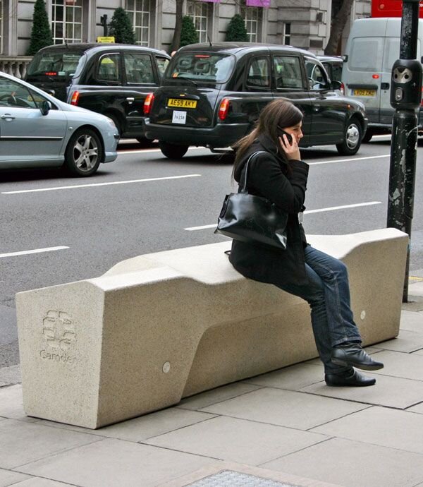
It’s 3,900 pounds, costs $4,661, and is characterized by waterproof coating and its lack of flat surfaces and crevices. No, I am not talking about Blind Men and An Elephant, I’m describing the Camden Benches that were installed in the 16th & Mission Bart Plaza. I can only think of two criteria when shopping for a bench: 1) it beautifies a space and/or 2) it’s comfortable, welcoming, and encourages one to leisurely spend time in a space. The Camden Bench is neither of those. Bart officials will try to convince you that it was a great choice because it’s anti-graffiti, thwarts skateboarders, and prevents liquids from accumulating. But there are other options that fulfill all those needs. These were chosen because they’re uncomfortable for people to sleep on.

I can’t remember which came first, the Mission Local article or my first-hand experience of sitting on one while waiting for the 14 to take me back to SoMa. But I do know that it left such an impression, that I went down the rabbit hole of opening every link in that article, and then opening all the links in those articles, and then on and on. If I hadn’t bought a new iPhone, all those tabs in the abyss that is my Safari app, would still be caught in a Schrodinger’s cat-esque state of being both, and between, open (and thus impossible to forget) and forgotten (because it’s buried under a million other pages, like who actually bothers to close each one?). I still think about the bench to this day, which is why I’m writing about it, but it’s also opened my eyes to the prevalence of public infrastructure and spaces that are antithetical to their sole purpose of being public goods.

I took so many classes in the Geography Department at Berkeley I could’ve received a minor in it, but anyone with a bit of common sense can explain what the difference is between space vs. place. There’s no science behind it, just experience. It’s very hard to argue that 16th/24th and Mission is just a space because I can guarantee you that if you were to ask someone to meet you there, they’d know exactly what you’re referring to. It’s a major crossroad where you can catch at least 5 different Muni lines AND Bart. It’s probably considered the southern most edge of San Francisco for folks coming up from the South Bay because honestly, who even gets off at Balboa Park or Glen Park? (Not to mention, micromobility wasn’t even offered around the Sunnyside area until later in 2019 because I guess it’s too far out in the ‘burbs.) But most importantly, it’s considered home for many people and small business owners.

The Camden Bench is unique because it’s an anti- /non-object. In other words, there are more things that make it not a bench and just a lump of concrete than there are features that make it a bench. If I can sit on something, does it make it a bench? But paradoxically, despite it’s lack of something-ness, it’s a very tangible and obvious example of the hostile architecture in our surroundings. Just take a look around you. For those of us who are fortunate to have a roof over our heads, these are just minor and fleeting inconveniences. But for others, these micro-aggressions are a daily reminder that they belong neither here nor there.

I worry that the Camden Bench is a symbol of the freedom we’ve lost in our public spaces — the freedom to use these spaces as we wish. I also fear that it is an ominous

symbol of the future [], a world where contrarianism — whether it be sleeping, skateboarding, scribbling — is made not just illegal, but impossible.*

Next time you find yourself having to sit through another “wow, you grew up in San Francisco?” conversation about how the city’s changed but can’t really put your finger on what’s disappeared, at least now you have one glaring, concrete example (ha!) that has appeared.

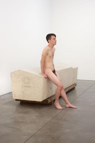
Roger Hiorns, Untitled (Security Object) with model (2013).

Roger Hiorns, Untitled (Security Object) with model (2013).

A defiant hero does God’s work.

A defiant hero does God’s work.

I’ll take a burrito from Guadalajara, thank you.

I’ll take a burrito from Guadalajara, thank you.

“Thank you Camden.” Obviously, the officials who thought the benches were anti-skate have never skated before in their lives.

“Thank you Camden.” Obviously, the officials who thought the benches were anti-skate have never skated before in their lives.

Non-objects suggest they could be something but aren’t.

Non-objects suggest they could be something but aren’t.

A woman using an archisuit designed by artist Sarah Brown.

A woman using an archisuit designed by artist Sarah Brown.

My mom told me I could be anything I wanted to be so I chose to be Spider-Man.

My mom told me I could be anything I wanted to be so I chose to be Spider-Man.

God forbid you need help looking for your lost cat.

God forbid you need help looking for your lost cat.

The Whole Foods in the Haight also has blue lights in the bathroom to prevent drug use.

The Whole Foods in the Haight also has blue lights in the bathroom to prevent drug use.

What’s up with NIMBYs and their rock fetish?

What’s up with NIMBYs and their rock fetish?

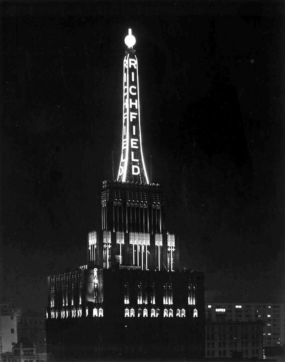
The Richfield Tower, Downtown L.A.

Looking up at the sky in Pershing Square. I did the walking tour with my camcorder in hand.

Looking up at the sky in Pershing Square. I did the walking tour with my camcorder in hand.

There are a million things to see and do in L.A., yet every time I visit, I always end up in the same 6 sq miles of the 469 that the city has to offer. If I were solo or had it my way, I’d spend every day exploring the smorgasbord of architecture in Downtown L.A. Using a whole day of one’s precious vacation time in just the Central Library’s exhibit alone isn’t what you’d find in most visiting guides, especially since the rest of Downtown L.A., particularly around Pershing Square, historically carries a reputation for being unsafe and dirty. But it’s precisely this boom and bust that has preserved the historic buildings and lowered its rents, and (re-)retransformed its image into a hip and sought-after area in the last 20 or 30 years.

The steel frame was erected in a record 32 days.

The steel frame was erected in a record 32 days.

You can quite literally trace the different periods, from the Beaux-Arts style preceding the renaissance of the Roaring 20s (as seen in the Millennium Biltmore Hotel) to the Contemporary and Deconstructive styles from recent years (as seen in the Broad and Walt Disney Concert Hall, respectively.) But that’s too much to unpack in just one post so I recommend you do the L.A. Conservancy’s walking tour instead (like I said, before Pershing Square became the ugly park that people like to hate on, it was the epitome of the city’s Golden age. The tour starts there because all it takes is a look up at the sky to change your mind.)

I’m here to share a little about the Richfield Tower. It’s strangely the one story I actually retained from the tour and yet, it’s probably the one point in the walk that no one else caught or recalls. It’s not a stop (but it should be) and the guide only mentioned it in passing about halfway through the 3 hour exhausting trek we made in the sweltering L.A. heat. I think the reason why I remember it is the same reason why most people won’t. You can neither see it nor photograph it because it no longer exists.

The Richfield Tower, also known as the Richfield Oil Company Building, was erected 1928-29 in the Art Deco style, representative of most architecture during that time. Its architect, Stiles O. Clements, is perhaps most well-known for the Mayan Theater (reminiscent of the aesthetic pioneered by Frank Lloyd Wright.) Built to not only serve as the headquarters for the petroleum company, it also flexed the success and lucre of the business. Both the facade, made of black terra cotta and, apparently, 14-karat gold-dust accent tiles, and the 130-foot tower atop the building, embodied a “black gold” gusher. Atypically,* the whole building was covered in tiles because all 4 sides were visible from Downtown L.A. and according to legend, it quite literally shined (I know the past tense is shone, it just doesn’t evoke the same image) because of the gold dust. It only makes sense that the project cost a whopping $1,750,000 (approximately $25,366,500 today when adjusted for inflation).

*I’m not quite sure why it’s considered atypical but based on a bit of googling, I think one of the characteristics of the Art Deco style is a “primary facade.” It explains why a lot of the buildings are heavily decorated with motifs, reliefs, and sculptures on one side but completely bare or minimal on others.

Unfortunately, following a merger in 1966, the Richfield Oil Company outgrew its 12-story office despite it boasting:

two barbershops, a dressing room, showers and steam room, a rubbing (massage) room, women’s lounge, hospital room, a florist shop, a penthouse with an outside patio area, an assembly room, two private dining rooms, a serving room and kitchen, a reception room, a cigar counter, a rooftop garden, numerous first floor rentals, three-floor underground parking lot, serviced by two automobile elevator, and not to mention air conditioning throughout!

After thwarting attempts to repurpose it (they claimed only half was usable due to obsolete utilities), it was demolished in 1969 along with the neighboring structures on the block to make way for the Atlantic Richfield Plaza. Luckily, perhaps thanks to the Angelenos and preservation enthusiasts who tried to save the Richfield from its demise, the original, grandiose elevator doors were salvaged, and presently stand (unmarked?) in the lobby of the City National Plaza, only offering passerby an infinitesimal reference to the grandiose scale of the icon that illuminated the Downtown L.A. area just a couple decades before.

Sadly, there are very few photos that capture the striking colors.

Sadly, there are very few photos that capture the striking colors.

It was a rare exemption from the city’s height limit ordinance of 1911.

It was a rare exemption from the city’s height limit ordinance of 1911.
The elevator doors now.

The elevator doors now.

The elevator doors then.

The elevator doors then.

40 angels gazed down on the city from the 13th floor. Sold at $100, the fate of many remain a mystery.

40 angels gazed down on the city from the 13th floor. Sold at $100, the fate of many remain a mystery.

Charles Pollock for Knoll International

For my birthday this year, I decided to get myself a piece of used furniture; it didn’t necessarily need to be designer but I did want it to be an investment and a lifetime piece. Perhaps it’s a side effect of aging. Perhaps it’s a side effect of the amount of time we’ve had to spend at home because of the pandemic (though I’ve always been a homebody, I learned the important lesson of having quality pieces of furniture the hard way when the folding conference chairs I acquired from the office’s liquidation and was using in my kitchen, absolutely wrecked my lower back.)

This 1961 Herman Miller newspaper ad suggests the Eames plywood chair was $35 at the time.

This 1961 Herman Miller newspaper ad suggests the Eames plywood chair was $35 at the time.

I visited my usual vintage stores for some inspiration and when one of the sellers I had recently gotten to know asked me what I was looking for and how he could help me find it, I instantly pictured all of the historic mid-century homes, and their living rooms, I had read about just a couple months ago. The homes featured in the book were most commonly furnished with pieces by designers like Le Corbusier and Eames; pieces that are no longer mass produced nor economically accessible, frankly. (According to a discussion between Charles and Hugh De Pree of Herman Miller in the book The Story of Eames Furniture, the final production prototype of the lounge chair was to retail for $310.)

As much as I’d love to own an authentic Le Corbusier chaise, as long as I’m living in the converted attic that is my current apartment, it’s not going to happen any time soon. I continued my hunt but narrowed my search to something that I definitely have space for and is a little more practical; an office chair (we’ve come full circle re: side effects of the pandemic). The ergonomics of chairs correlate to their price which means unfortunately, office chairs can cost a pretty penny. But that also means, given just how much time we spend in them, cost per wear is lower.

At least that’s what I told myself when I spent $420 on a chair that was “love at first poor-quality-Craigslist-image sight.” To be completely honest, I didn’t do any research into the chair or the designer before buying it (nor was it really mentioned in the listing; only that it was a Knoll chair from an estate sale several years ago), which is why I’m writing this post to justify the purchase and reassure you of my decision. Spoiler alert: it was totally worth $420.

I’ve definitely seen the this particular chair in interior design inspo pics and in the homes of people whose style I admire, so I knew it was a coveted chair. Turns out, Knoll isn’t even the name of the designer, but the name of the manufacturer and distributor. After some digging, I learned that this particular model is called the Pollock Executive Chair, named after its designer Charles Pollock, who at one point worked for lead designer at Herman Miller (I love it when I discover unexpected connections), George Nelson.

Pollock set out to create a chair inspired by a single line. “Everything has an edge and everything is a line…I experimented with wire and curved the edge…I developed the idea of ‘rim technology’ and hit on the design. It doesn’t rust, it doesn’t tarnish, it doesn’t fade. It keeps its visual appearance almost forever. In other words you have a visually pleasing color or texture or chrome finish articulated in a fashion that goes around the edge of the chair, which is beautiful and acts as a guard against destructing the chair no matter where you hit it….up, down, front, side, back, whatever.”

This model was introduced to the world in 1965 and has been in production ever since (my chair is dated Aug 11, 1983). It’s a staple in American office culture so it makes sense that it screamed ICONIC to me when I first saw its listing. Perhaps you recognize it from Mad Men (I don’t because I’ve never watched the show.) Luckily, because it’s still in production, I know exactly how much the Pollock chair is worth, not even factoring in the historic and sentimental value that vintage ones carry, and can confidently say that I’ve outdone myself with this year’s birthday present. Good luck to me next year.

Super Normal

Paper clip by Norica, Germany. Tiny balls at the end prevent scratching paper but still super normal. Everything I aspire to be.

Paper clip by Norica, Germany. Tiny balls at the end prevent scratching paper but still super normal. Everything I aspire to be.

I’ve always been a little cynical about a career in art. I thought it was reserved for people who are extraordinarily talented, present a certain way, or know the right people. It could be because my discipline at the School of the Arts was classical piano, which is hardly a team sport, but also because we had little guidance around pursuing a career in art. (It also didn’t help that the artists in residences were clearly not getting paid a lot.)

I’d say about half of us, cracked under societal pressure to do a 4 year degree and find a steady job. And the other half said screw it, life’s too short for this, and went after whatever dreams they had. I look now at the classmates who pursued their passions and see just how how much they shine.

Paper clip by Prada. $185 but super-ficial. Everything that’s wrong with this world.

Paper clip by Prada. $185 but super-ficial. Everything that’s wrong with this world.

A couple of weeks ago, I got rejected from a position at the SFMOMA. It wasn’t my “dream” role and they were probably right about me being overqualified but the SFMOMA is up there on the list of “dream” places I’d like to work for. I let myself be sad about it for about 2 days and then moved on. Maybe moved on isn’t the right phrase, it was more like I moved forward. Because being upset about a circumstance that’s beyond your control is pointless and unproductive. I don’t need to wait around for someone to start paying me, to be able to write about the topics I want to write about (although I have to admit it’s a lot less nerve wracking.)

I am neither extraordinarily talented nor do I present a certain way nor do I know the right people. In fact, I’m super normal (and a Taurus if that means anything to you.) But if you’re familiar with Jasper Morrison and Naoto Fukasawa’s thesis about the super normal, then you’d know why that’s a great thing (I’ll write more about this in a future blog post.)

Likewise, this blog is going to be super normal. My intentions aren’t to philosophize or analyze history and theory; just share my appreciation for art, creativity, and aesthetics. It’s going to be a collection of stories, photos, and facts that led to first-time experiences, sensations, and feelings. I hope that at the very least, it sparks something in the reader much like it did for me, but most importantly, serves to remind the future me, who may or may not be feeling burnt out or uninspired, how important it is to stay curious.