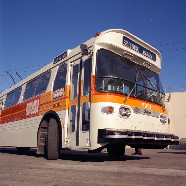
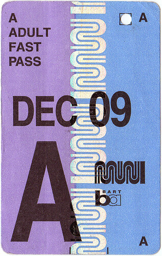
As both evidence and apology for my inability to sit down and write lately, I’m back with a really short post on the history of the current SF Muni logo. Despite living here 20+ years, it was only 5 years ago that I realized that it actually spelt out “M U N I.” It wasn’t like I looked it up or spent some time trying to figure it out, I was just sitting on the train, zoned-out and bored, with nothing to do because there’s no service underground; I was absent-mindedly looking at it, when BAM, it finally hit me. I got a lot of Haha reactions out of it on Facebook but in my defense, I’ve been exposed to it before I could even read, so to me as a kid, I thought the logo was a pictograph of squiggles and I just continued to assume the same as I grew older (and I confirmed with friends I grew up with, that they believed the same.)
When I made my post on Facebook, I got a comment from a Taiwanese friend that she instantly saw it as an homage to SF’s famous Lombard Street. It was a theory, one that’s been echoed by commenters on other forums, but hasn’t been addressed by the Municipal Transit Agency. In fact, the MTA seems to refer to this particular logo, of all their logos in their ~100 year history, as….the worm.
As part of Muni’s larger rebranding effort, the worm was debuted in 1975 by famed SF-based designer Walter Landor, who might otherwise be known as the legend behind Coca-Cola and FedEx’s logos. It apparently cost a whopping $100k to develop, which I guess is nothing compared to the other ridiculous things the city’s spent money on (like actual trash.) Even though the rebranding effort of the 1970s was allegedly a big deal, I found very little from the MTA about the inside-look or unveiling of these projects. I also read a comment about the squiggles representing the railway tracks, which makes the most sense, but that can neither be debunked nor confirmed.
In 1997, there was an attempt to find a new logo, the logic being that a a cosmetic makeover would “boost employee morale and give the public a new sense of confidence in the ailing agency, which has been denounced by critics for rude drivers and constantly late buses” (make it make sense?? maybe invest in those problems first??) However little we know about the worm logo, it’s withstood the test of time and has become a local and national favorite.
Bonus content: Love this “vision for the future” rebranding concept by designer Derek Kim. Unfortunately, I don’t think he was anticipating the rise in popularity of Supreme so I would reconsider the colorway but otherwise, I’d love to see his sign posts and totem poles come to fruition one day.
We all want to bring these back.
A flyer I made using the free MUNIficent font.


